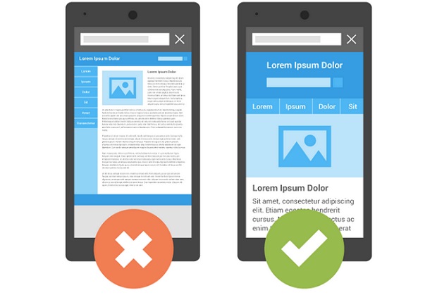
Marketers and website owners need to follow a separate strategy to help their websites rank higher in phone searches, paying particular attention to user experience and technical factors, accoridng to new research.
With more Google searches now happening on mobile devices than on computers in many countries including the US, the new study from Searchmetrics analyses the key commonly occuring elements of pages that rank higher in mobile phone searches.
The Searchmetrics Mobile Ranking Factors US 2015 study examined the top 30 mobile phone search results for 10,000 relevant keywords on Google.com.
The study indictaes that pages ranking higher in mobile phone searches tend to differ (from those that rank higher in computer searches) in areas such as font size, wordcount, interactive elements (buttons/menus), presence of unordered lists, number of images, number of internal links, file size, page load times and use of responsive design/dedicated mobile sites.
However, across both phone and computer search results one of the most important ranking factors is good quality, relevant content that comprehensively covers the topic according to the study.
“More Google searches now take place on mobile devices than on computers in 10 countries including the US¹ and with its mobile friendly update, Google has made it clear that search results presented to mobile phone users should provide a good experience,” said Marcus Tober, CTO and founder of Searchmetrics. “Our first detailed study of mobile ranking factors offers insights into what is commonly found in high ranking Google search results on mobile phones and how this differs from desktop results.”
Three important areas covered by the research are:
1) User experience – adjust font size and use fewer menus, buttons and images
The smaller screen size and touch-based navigation on mobile phones means marketers need to pay specific attention to the mobile user experience to help their pages rank higher. This is why one in five pages (22%) ranking in the top 30 mobile search results use responsive design that automatically adjusts the format to suit a mobile, tablet or desktop. Many also use dedicated mobile sites.
In high ranking mobile search results, the average font size above the fold (visible area without scrolling) is significantly larger than on high ranking desktop results. Yet when you scroll down, the fonts on mobile phone pages are found to be smaller than on desktop pages. The above the fold text has to be bigger because it often includes clickable navigation links that let visitors click through to different parts of the site.
High ranking mobile pages generally have fewer interactive elements such as menus and buttons as well as images. 72% of mobile pages in the top 30 search results contain at least one unordered list (e.g. bullet points) to help structure information (around a quarter more than in desktop search results). However, the lists on mobile pages are usually much shorter, with fewer individual points.
2) Technical – minimize file size & load time and avoid Flash
The average mobile page file size was found to be around 25% smaller, allowing faster load times. Only 5% of mobile pages make use of flash design (mostly used for animation and video), which is not widely supported by mobile devices, compared with 14% of desktop pages.
3) Content – should be relevant, holistic and high quality
Holistic and relevant content remains one of the most important factors for high Google rankings in both desktop and mobile searches according to the analysis. It is paramount that both mobile and desktop pages cover topics comprehensively. For example analysis of the words in high ranking pages in both desktop and mobile searches indicates that a high percentage (above 70%) contain important “proof terms” strongly related to the search topic, while around half also include slightly more distant “relevant terms”.
The study found variations between mobile and desktop content in some areas. High ranking content on mobile pages tends to be shorter on average (867 words) than on desktop (1285 words). It also includes significantly fewer internal links to related content on the same site (probably because Google advises against placing links too close to each other on mobile pages).
To read a more complete analysis, download The Searchmetrics Mobile Ranking Factors US 2015 study from: http://www.searchmetrics.com/knowledge-base/mobile-ranking-factors/
Methodology
Searchmetrics’ analysis is based on an analysis of the Google.com mobile phone search results for 10,000 keywords. The keyword set is identical to that used for the desktop ranking factors study, to enable a meaningful comparison. The data for the mobile results was pulled after the Google mobile-friendly update. Where logical, mobile comparisons with the previous year have been integrated with desktop results. In certain cases, Wikipedia has been excluded from results to more accurately reflect current trends and avoid data skew. Find more info here: What is a ranking factor?

