


In 2013, Spreadshirt created a touch-optimised t-shirt design tool for tablets, but didn’t think it would catch on. But then it saw a 73% rise in smartphone orders. Tony Findeisen, the lead-developer at Spreadshirt, offers tips on how to create for the smartphone ecommerce experience.
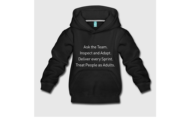
My development team at Spreadshirt has a ‘get shit done’ approach; an agile development process, only faster. It’s led to our first thumb-friendly, t-shirt designer only for smartphones. As we reuse components, our process is so quick and cool we also have the time to investigate new ideas; like experimenting with a voice-controlled version.
Development teams need the time, and freedom, to experiment with new technologies. But the experiments must be customer-led. Never try to get the customers to do what you want them to do. Always build around them. We do a lot of user testing and analyse our customers´ behaviour to work out what they want.
In 2013, our user-analytics were showing a rise in visits from mobile devices to our ecommerce, print-on-demand platform. At that time, analytics showed that customers were buying from their tablets rather than smartphones. We thought that smartphones would be the future of shopping, but one step at a time. So, using a component-based declarative JavaScript framework, we created a t-shirt designer for tablets. And we made sure that its main functionalities would also work on a smartphone screen, even if the user experience on a phone wasn’t as good as on tablets. After the launch, not only did visits from tablets start to rise, but sales were ticking up too.
Fast-forward to 2016 and our analyses proved that now our customers DID want to visit and buy from our site using their mobile phones. In some countries, 45% of our traffic is generated on mobile devices and last year the share of orders coming in via smartphones rose 73% year-on-year in the UK and Europe. Globally we saw a 40% rise. Now at Spreadshirt, we no longer have a mobile-first strategy; mobile IS the strategy!
One learning was that responsive design, running the tablet version on smartphones, is possible, but the user experience and how people interact with the device is totally different, so we needed to build a dedicated version for phones. To make shopping via a phone easier, we needed to create a smartphone-specific t-shirt designer.
We reused source code in form of components from the tablet designer and reformed them to build the smartphone version. We adjusted the layout and the style to meet the UX criteria specifically for smartphone users, e.g. all elements right at your thumbs. So the smartphone t-shirt designer has basically the same functionalities, it shares 90% of the source code, but has a different look and feel.
For example; All the buttons are aligned to bottom of screen, including navigation, to make it easy to get around using your thumb. It also allows you to focus on the part of the design you’re working on; such as text editing in full screen.
By reusing the code and practices we’d already established, we could launch our first release after 40 hours of development for online user tests. We sent the first real user traffic after just 80 hours of engineering work. Another major advantage of reusing the code is that when we do a bug fix or a new feature it is only developed once and is immediately available in both the tablet and the smartphone version.
So what’s next? We’re seeing the user interest in voice-controlled products like Alexa and working on making it possible to design & order in German & English (Android only). Anytime soon you’ll be able to tell your smartphone to “Make me a green t-shirt with ‘get shit done’ written on the front”. Try it out here https://www.spreadshirt.co.uk/-C59?smartomat&voiceControl=true
By Tony Findeisen
Frontend Architect and Team Lead
Spreadshirt