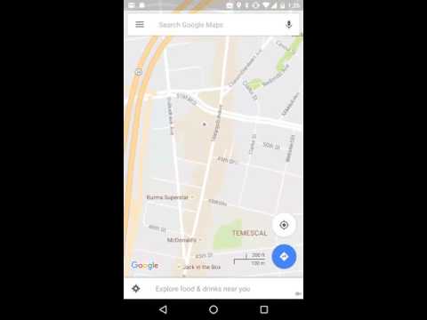
Google have introduced an attractive refresh to the look and feel of Google maps.
New fonts are a lot clearer making for improved readability. Google say they are looking for a “subtle and balanced” feel. Items such as roads and buildings are more simply drawn, with road and location names standing out.
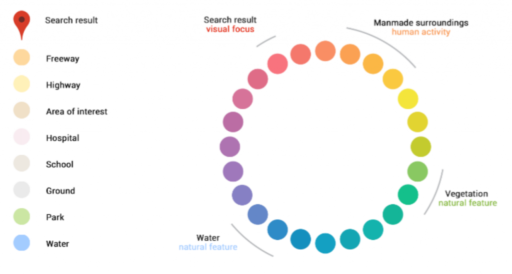
Colours of man-made and natural features have been designed to be even clearer to easier tell apart. Buildings such as hospitals, schools and motorways all given their own colours.
The new look and feel is supported by new back-end algorithms are designed to highlight areas of particular interest, such as restaurants and shops. Again a simple colour shade is applied to these areas helping you locate areas quickly and simply.
The new maps are being rolled out and will be available on IOS, android and web formats.Whilst this essentially this is a de-cluttering exercise, it certainly seems to work.