


Garry Taylor, UK Art Director at Say Media, believes you should never judge a book entirely by its cover, but argues that online, first impressions really count.
Substance should always win out over style, right? However, in the digital world – where you have literally (milli) seconds to grab someone’s attention – first impressions still count. People make snap judgments all the time in daily life, forming lasting first impressions of people, places and products in an extraordinarily short period of time. You may make a final choice on a new perfume by testing it out with a little spray here or there, but how did you decide which perfumes to try on before you even smelt them?
When a reader lands on your website, it’s often their first interaction with your brand. That first impression your site’s design creates is crucial in grabbing users’ attention. Google research has confirmed that site visitors get an initial ‘gut feel’ for your site within 50 milliseconds of landing on it. By comparison, the average blink of an eye takes 100 to 400 milliseconds.
You can’t expect people to stick around if that first impression is dull or confusing. The quality of the content might be great, but what good is it if users get put off before ever reading a word?
First impressions not only count. They last.
Google’s key finding from their research was that users love simple and familiar designs. They follow digital conventions. Think about some of the websites you visit on a daily basis. Chances are, they are aesthetically pleasing and visually make sense to you.
If we consider content-heavy news websites, all of which are complex sites, we see lots of long-form content, multi-levelled navigation, related content links, ad placements, social sharing mechanisms, etc, etc – at first glance we see a vary similar approach to website design and layout. Two or three-column grids abound, the area ‘above the fold’ (seen on initial page load) contains a lot of the site elements – logo, navigation, headlines, ads – most important to the various site stakeholders.
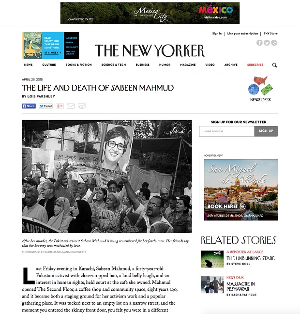
But the application of good design practices can have a great impact on the initial impression the site gives the user. In the above example, The New Yorker feels intelligent – a premium environment – due to the use of clear navigation, good amounts of whitespace and legible typography. The content is allowed room to breathe and is clearly the most important element of the page.
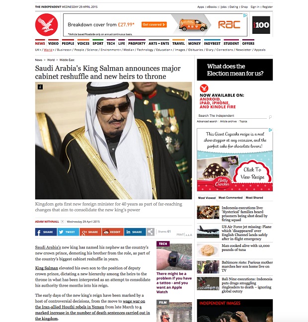
Compare that to The Independent, with it’s cluttered appearance, multitude of navigation, ad spots and competing content links. It’s hard to focus on the actual content on the page – not a great place to absorb information.
It’s not just above the fold that requires style to help present substance. If we look further down the page, where the main bulk of the content lies, we can still see differing ways of approaching site design. The Guardian site strips away any superfluous design elements, save for a few carefully placed content images, key related content links and a sole ad spot. This allows the reader to focus solely on the content of the page.
In comparison, The Express layers on lots of additional editorial links (all with competing imagery), related article pullouts and intrusive social sharing mechanisms, all of which add to the general confusion onscreen. Combined with poor typography, it’s a difficult environment in which to focus on content.
The good news is that we are now starting to see more frameworks put in place for building better digital media experiences – beautiful, content-focused, engaging and device-optimised websites – that seamlessly integrate community, commerce and marketing, all without sacrificing the rich editorial experiences that help put content front and centre for the reader. Compare flipping through a beautiful, carefully laid-out print magazine to clicking through a standard content site. The former is a lush, stylish journey, whereas the latter generally lacks much sense of design, style and craft.
But, conversely, style is nothing without substance. Honest, good quality content is able to change people’s minds about a brand far more quickly and efficiently than any amount of banner ad impressions. Unconvincing, dishonest content, however, will damage a brand’s reputation. Having engaged with content, the reader should walk away feeling moved to act positively, whether that means sharing it or making a purchase either online or in store – and that’s where substance comes into play.
In the end, it’s the charm, character and quality of content that takes readers or consumers close to brands and keeps bringing them back for more. But it’s intuitive design, structure, colour use, spacing, symmetry and clear navigation that attracts them in the first place.
Offering both style and substance is what sets great brands and websites apart from others.