


Google has launched a new logo to mark the companies recent restructuring under the name Alphabet.
The new Google logo sees dropped the serifs that made the letters distinctive but harder to read on the tiny screens of mobiles. In doing so, it recognised one of the most important changes during its 17 years — like Google itself, the logo had been designed to be looked at on screens, but now a huge proportion of web browsing is done from phones and other mobile devices.
The new Google logo ifeatures softer colours and bears a bit more resemblance to the logo of Google’s new parent company, Alphabet, as well. Alphabet’s wordmark has a similarly unadorned look, and this update makes the two companies’ design language fall more inline.
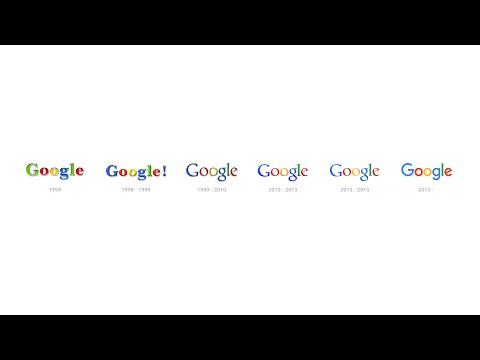
As Google’s video introducing the new logo notes, the wordmark has been evolving ever since it was created in 1998. But this is easily its biggest change since 1999, when Google first cleaned up the lettering and settled on its four colors. Since then, the logo has just been flattened out more and more, with today’s update representing a huge leap. In addition to changing up the wordmark, Google is also changing the tiny “g” logo that you see on browser tabs.
![]()
It’s now going to be an uppercase “G” that’s striped in all four of Google’s colors. Google says that the new design will be rolling out across all of its products soon — in fact, it’s already on Google’s homepage, with a cute animation that wipes away the old logo and draws in the new one.
Watch this video tracking the evolution of Google below:
Read the official blog here:
http://googleblog.blogspot.co.uk/2015/09/google-update.html